Accessibility
As a public institution, DTU is covered by the Web Accessibility Act. This means that all DTU's websites and apps must be accessible to everyone – including citizens with disabilities.
Web accessibility is about the principles and techniques to follow when developing websites, mobile applications and other technical solutions so that they can be used by everyone, including users with disabilities.
What can you do as an editor?
Part of the principles deal with the CMS (Sitecore) and the way it is coded. AKM and AIT are jointly responsible for that part, and ongoing work is being done to improve accessibility.
However, there are also a number of things that you as an editor can do to ensure that your website meets the requirements of the law. The most important things to be aware of are:
- Alternative text on images
- Sufficient contrast between foreground and background
- Explanatory text on links
- Explanatory text on buttons
- PDFs and Word documents
- Structure and headings
- Tables
Alternative text on images
The Web Accessibility Act requires that content that has meaning but is not text must have a text alternative for the blind and partially sighted. The requirement includes, among other things, images and graphics. If you use, for example, a picture of a graph that contains information that is not specified in the text, it is important to have an alternative description that tells you in words what the graph shows. The alternative text or 'alt text' is read out by a screen reader.
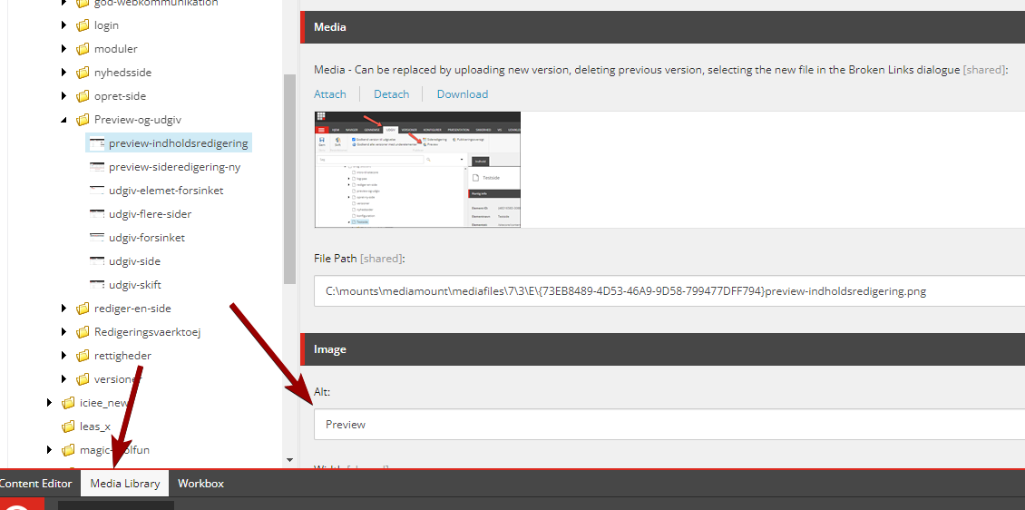
How to do it: The alternative text/'Alt text' is filled in Sitecore, in the Media Library. Make it a habit to fill in the 'Alt' field every time you add a new image to the Media Library.
Sufficient contrast between foreground and background
Ensure a sufficient contrast ratio between foreground and background, so that texts, buttons or other graphics stand out clearly in relation to the background. This applies, for example, if you use text on a background color other than white or text on top of images, or if you insert buttons or other graphics in a colored box.
According to the Web Accessibility Act, the visual presentation of text and images must have the following contrast ratio
- Regular font size: at least 4.5:1
- Large size font (18 point or 14 point bold) at least 3:1.
(Contrast ratio can range from 1-21 – the higher the number, the greater the contrast.)
How to do it: There are various online tools where you can test the contrast ratio by entering color codes for the respective foreground and background color. For example: https://webaim.org/resources/contrastchecker/
NB: Major development work is ongoing on the Sitecore platform, which must ensure that the built-in standard colors and color combinations in the system meet the requirements for accessibility.
Explanatory text on links
All links must have an explanatory text that describes the purpose of the link, i.e. the result you achieve by activating the link.
How to do it: Write a link text that clearly explains what happens when you click on it. For example: 'Read more about how to apply for SPS at DTU'. Make sure to use keywords in the link text and avoid links like "Here" and "Read more". Also make sure to make precise links that can be separated from each other if there are several links on the same page.
Explanatory text on buttons
Buttons on the website must have an explanatory text that tells the screen reader what the function of the button is. Color and shape must not be the only indicator that it is a button.
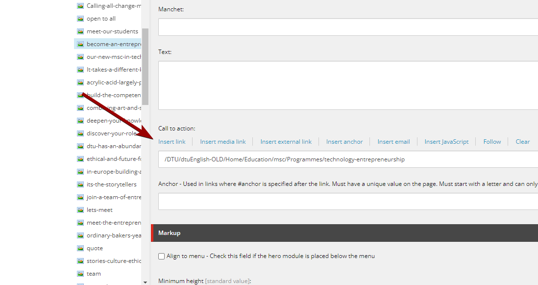
How to do it: If you put a button on your website in the form of an image with a link on it, make sure to give the button/image an explanatory alt text, just like on other images. (see 'Alternative text on images'.)
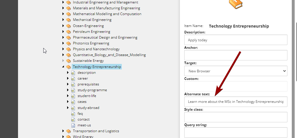
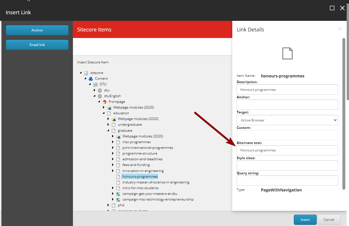
If you use the built-in buttons in Sitecore, remember to put an 'Alt text' on the button's link.
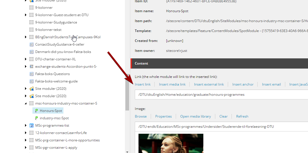
When you create links in Sitecore's modules, you must also remember to either give the link an explanatory link text or write an 'Alt text' on the link.
In a Hero module, you put an alt text like this:
PDFs and Word documents
It is a requirement that the visually impaired must be able to access a document on a website (e.g. pdf or word document) and have it read aloud with a screen reader. However, the requirement only covers documents published on the website after 23 September 2018 and documents published before this date if they are "necessary for active administrative processes".
How to do it: If possible, avoid using pdfs and word files, and instead enter the information directly on your website.
Alternatively, you must ensure that the documents you put on your website are structured and formatted so that they comply with the applicable standards.
Read more about available documents
Structure and headings
If a screen reader is to be able to read a meaningful text out to the user, it must have help to find its way around the page and to read out the page's elements in the right order, with pauses at relevant places. A logical structure and a correct selection of headings help.
How to do it: Divide your text into paragraphs and use the built-in heading formats to mark headings and subheadings: H2, H3, etc. This gives the content on your page a structure that makes it easier for the screen reader to read the page.
You will find the heading formats in the text editor in Sitecore:
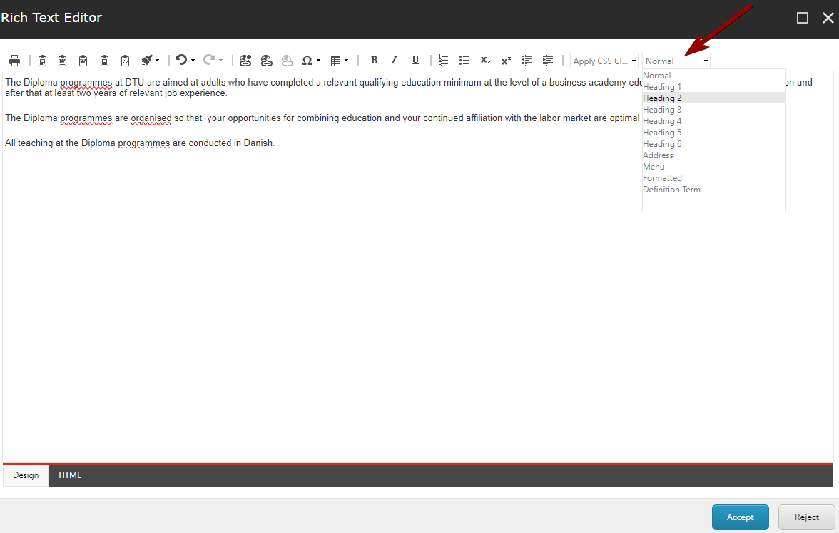
By using the built-in heading formats, you also help search engines find relevant content on your page. You will not achieve that effect if you instead choose the font size yourself and, for example, bold text.
Tables
Tables are more difficult to make accessible to a screen reader than text. Tables should therefore be avoided as far as possible.
If you use tables, make sure they are as simple as possible ie. with few rows and columns. Also, be sure to use Sitecore's built-in header formats for both row and column headers.