Wide module
The structure of the Widemodule
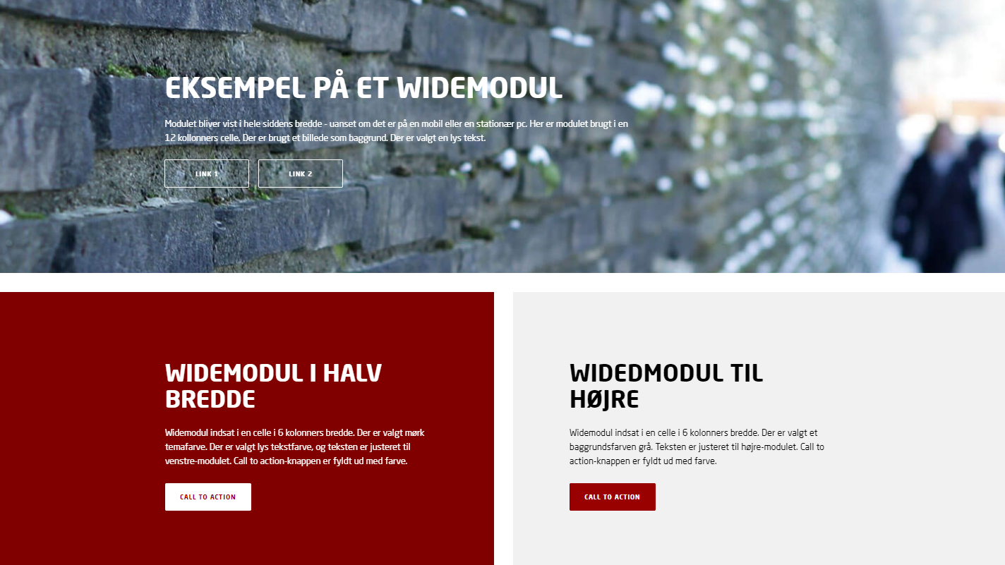
A wide module is characterized by being displayed across the entire width of the page. The module consists of:
- Theme color or background image or background video
- Title and Subheading - it is possible to choose light text, the text can be centered or adjusted to the left/right.
- Call to action link (button) - up to five link buttons can be inserted. The button can either be filled with color or transparent with a border color.

Edit a wide module
- How to insert a module
- How to edit a module
Special elements
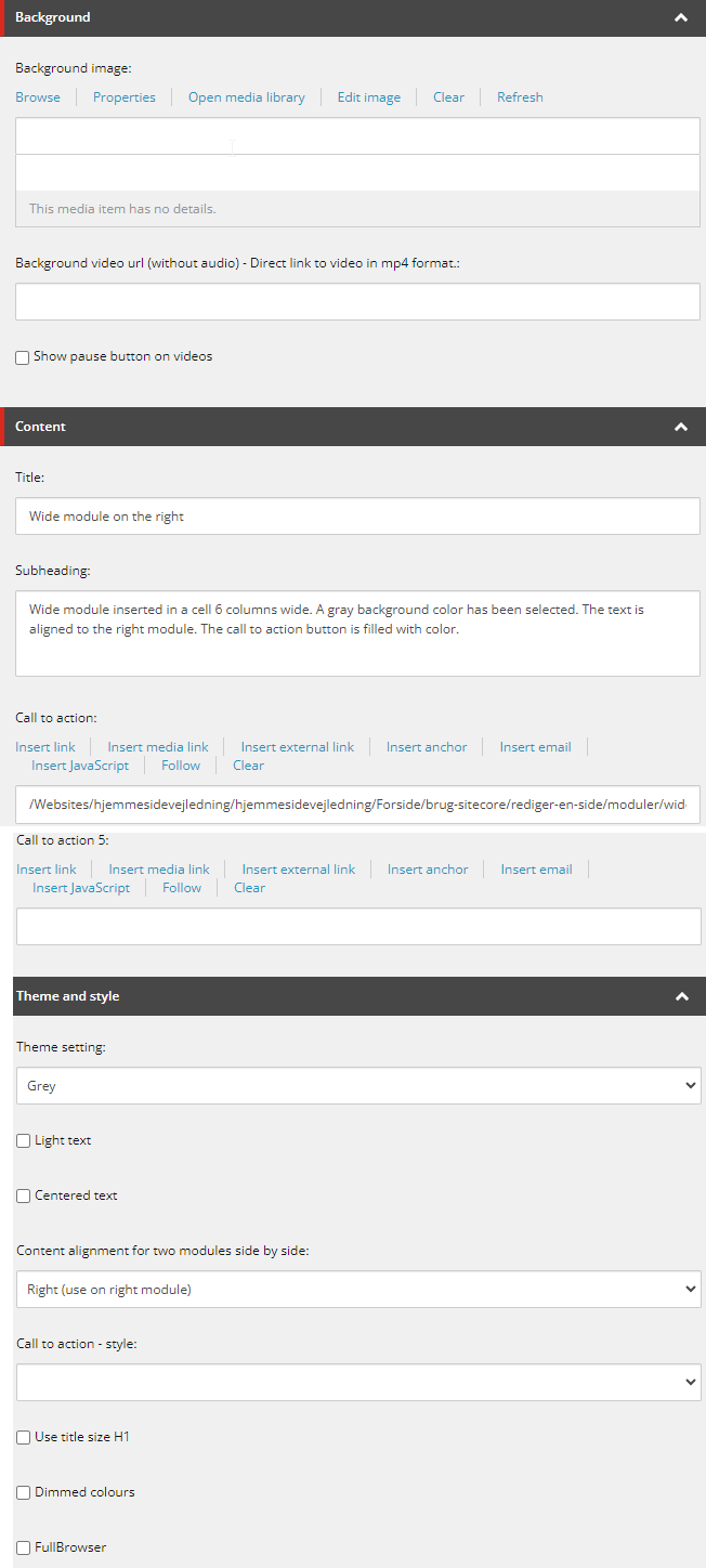
- Background image: An image from the Media Library can be inserted. How to insert a picture
NB: Be careful to choose a background image with a calm image surface, so that the text on the image can stand out as clearly as possible. Also pay attention to the contrast ratio between the background image and text, so that the text appears readable. Read more about accessibility - Background video: A video can be inserted: How to insert a video
- Call to action: Up to five links can be inserted, which appear as buttons on the module. The link text is displayed as text on the button.
- Theme: Here you can choose a background color for the module. Choose between 'Theme color' (corresponds to the site's theme color), 'Theme color dark' (the site's theme color in a darker shade), Gray and White.
- Light text: If you put a checkmark here, the text on the module is displayed in a white color. Without a checkmark, the text is black.
NB: Do not use light text on a light background color/a light background image. The contrast ratio must be sufficient to comply with accessibility regulations. - Centered text: If you tick here, the text on the module will be centered. Without a tick, the text is left-aligned.
- Content alignment: Used for two side-by-side modules (two modules 6 columns wide). 'Right' is used on the module on the right. 'Left' is used on the module on the left.
- Call to action - style: Determines the appearance of the call to action button. Choose between 'Transparent with colour' or 'Filled with colour'. If you do not select anything, the button is displayed filled with color. The color of the button follows the theme color of the site. If 'Light text' is selected, the button will also be light.
- Use title size H1: Only checkmark here if the wide module is used as the top module at the top of the page.
- Dimmed colors: If you checkmark here, the colors of the wide module will be dimmed. The tinting of the module will follow the theme color that may is selected for the wide module.
- FullBrowser: Checkmark here if you want the wide module to be displayed in the entire browser window.

Wide module can be inserted here:
12 columns container - full width (XL):
- cell 6 columns (XL)
- cell 12 columns (XL)
NB: Wide modules can only be inserted in 12 columns container - full width (XL).
